


This was originally posted on Twitter, but I’ve unrolled it here because I’d like to open this to further discussion, and I feel Twitter is too ephemeral to maintain that type of interrogation.
So I’ve been thinking about how polarized our culture has become lately, and what we might do to remedy it.
Then I read a few articles on MIT @techreview. First this one about the influence of social media — first positive and hyped, and then negative and denigrated:

And this one about how we all place ourselves into “filter bubbles.” Many people in one scientific study “were surprised to learn just how cocooned inside far-right or far-left bubbles they were.”
So it got me thinking about how *everyone* might better visualize their own cocoons, and what tools might let the average person know (right or left, elf or wizard) their own cognitive biases.
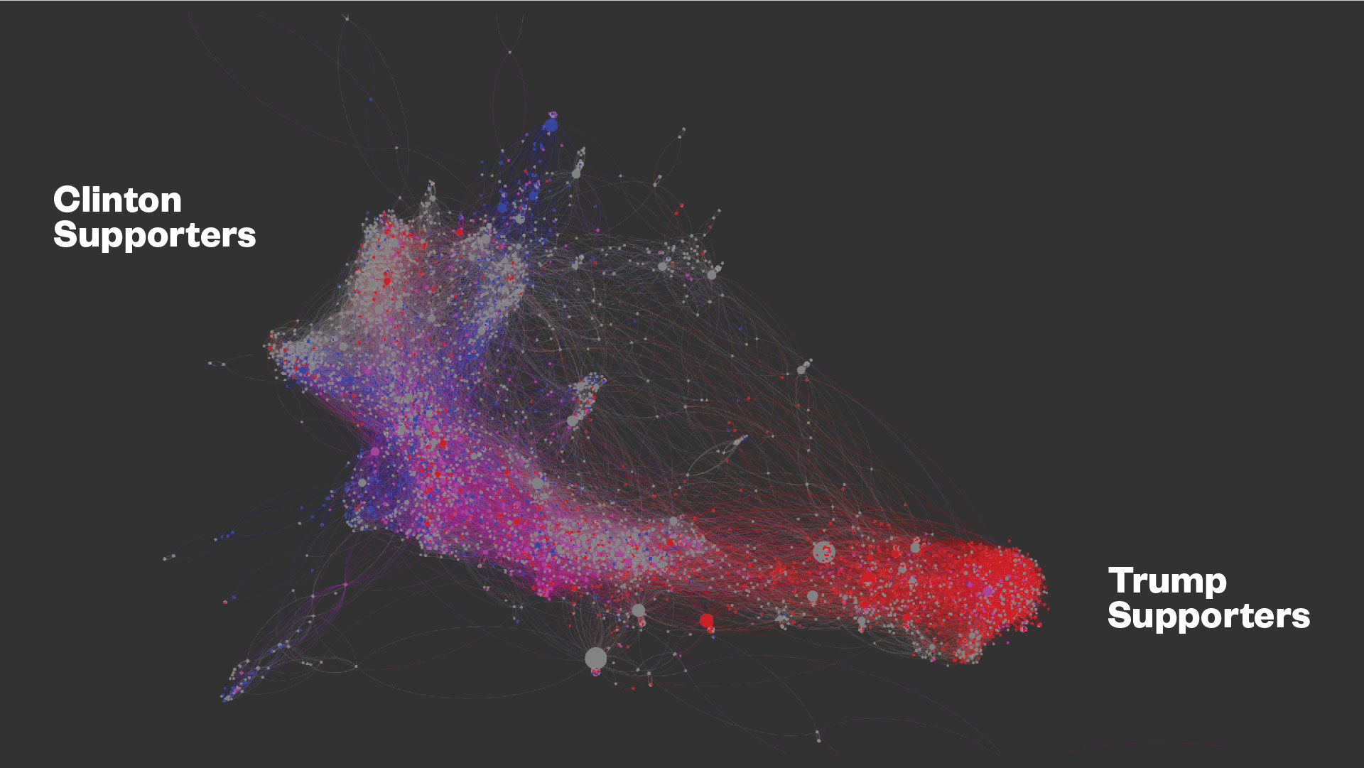
The perfect data for this is our *own* social graph. The social media companies: YouTube, Facebook, Twitter — they all obscure our social graphs from us.
This is good business practice for them. Why is keeping our data hidden from us a good thing for them? Because they profit from our social graph. They use it to advertise to us. It is their primary business model.
But we should at least be able to view our *own* social graph easily. I mean, if they’re going to profit off of graphs of our clicks and likes and web-page visits, then at least we should be able to see those graphs too.
So I started looking for tools that might easily show us our *own* social graphs. The social media companies at least make a show of saying we can always download our own data. But how easy is this? I mean for the average person to view?
Some googling led me to this page, where I was surprised that the tool did just what I was looking for. It shows you your social graph in easy to understand visual diagrams. wolframalpha.com/facebook/
Excited, I followed the link to the Facebook app. But lo and behold, I get a 404: File Not Found. apps.facebook.com/wolframconnect…
Either @Wolfram_Alpha or @facebook removed the link to that app. Which is a damn shame, because, as the articles above suggest, seeing visualizations of our own social graph might help us overcome the extreme polarization of our culture right now.
I think visualizing how we, ourselves, are connecting with the (digital) world might raise awareness of our own cognitive biases. This is true for people of all parts of the political spectrum.
I don’t see how more awareness is a bad thing. When someone is disturbed, a therapist usually works to bring the troubling issues to consciousness. Through awareness and reframing, the trauma is healed.
I think a tool like the Wolfram one above, and others just like it if they exist (I will search for more), might help us to heal as a culture. I believe it would be one tool that’s worth trying.
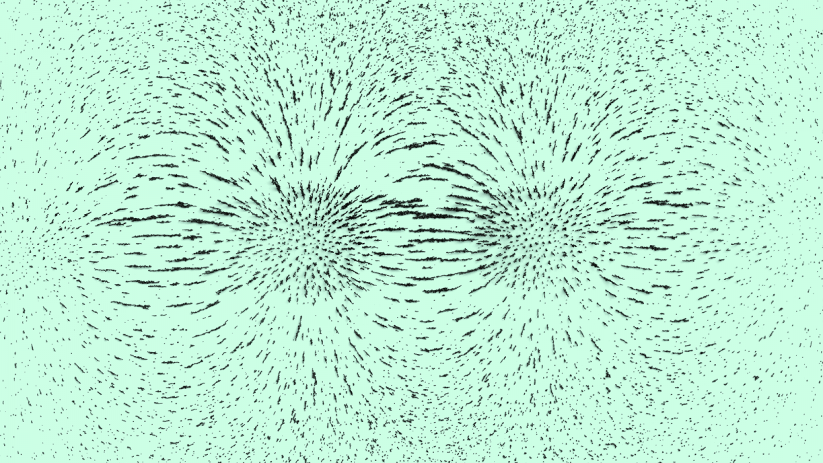
PS: here’s a page showing what some of those charts might look like: blog.stephenwolfram.com/2012/08/wolfra…
| Read the first novel of the Worldmender trilogy King of Shards free now when you subscribe to my newsletter. | Read Queen of Static now, the follow-up to the groundbreaking novel King of Shards. |
 |
 |